Some paint colors are easy. White, beige, and even green can usually be figured out with a few samples and decent lighting. I feel like red is not one of those colors. Red can seriously test your patience, your decision-making skills, and sometimes your sanity. This list is meant to be your shortcut.
As I said, red paint is tricky. It can look rich and elegant in one room and a complete mess in another. The wrong shade feels like a bad theme restaurant, where the right one will feel timeless.
This is a list of the reds that actually work. No guesswork, no regret. Just the hits. Let’s get into it!
1. Sherwin Williams | Sommelier 7595
Deep, moody, and made for kitchens and dining rooms. Works best when you want the space to feel more like a destination than a pass-through. I just know that I will find a way to incorporate this into our kitchen… or literally anywhere in our house. It is easily my new color obsession.

2. Sherwin Williams | Antique Red 7587
Classic, straightforward red. A solid choice if you want drama without tipping into overly dark or overly bright.
3. Sherwin Williams | Fireweed 6328
Earthier and more grounded. Great in spaces that need the vibrancy of red, but in a more muted, subtly way.
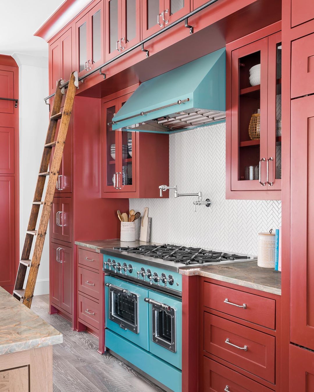
4. Sherwin Williams | Reddened Earth
Lives up to its name. It reads like traditional red Earth but more refined, which makes it versatile indoors and out. This kitchen design is absolute perfection with Reddened Earth on the cabinets. It’s bright and cheery without being overly playful, I just love it!

5. Sherwin Williams | Toile Red 0006
Classic and slightly old-world. It leans traditional without looking outdated, which is harder to pull off than it sounds.
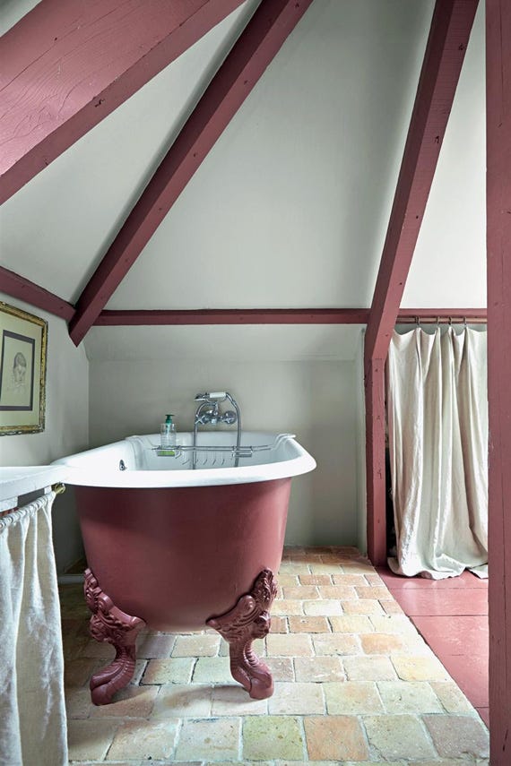
6. Farrow & Ball | Eating Room Red No. 43
Warm and enveloping and just yum. It does exactly what the name suggests and makes a dining room feel intentional and inviting. However, it’s not just for dining rooms, and this bathroom proves that. Red clawfoot tub? Yes please!
7. Farrow & Ball | Incarnadine No. 248
Strong, saturated, and confident. The kind of red that defines a room instead of just filling it. In my opinion, it’s the perfect timeless red.
8. Farrow & Ball | Fox Red No. 48
Softer and more approachable. Has a slightly weathered quality that keeps it from feeling too polished.
9. Benjamin Moore | Cottage Red HC-174
Straightforward and classic. Works especially well for exterior doors and is perfect for color drenching your room.
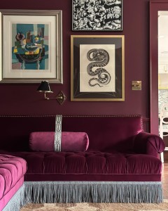
10. Benjamin Moore | Radicchio CC-32
A fresher take on red with more of a blue undertone that pulls in that violet energy. Keeps things colorful without getting overly pink toned.
11. Benjamin Moore | Dinner Party AF-300
Rich and formal. Suited for cheerful kitchens or studies where you want to add some happiness.
12. Benjamin Moore | Pomegranate AF-295
Vibrant with depth. Bold but still elegant, making it one of the more flexible strong reds. I love it mixed with deep, muted blues… it makes the perfect contrast.

Red might not be the easiest color to get right, but when you land on the shade that works, it completely changes a space. These picks are the ones worth considering if you want impact without regret.
If you try any of these colors or already have a favorite red on your walls, drop it in the comments. I’m always in need of more recommendations… you know, constantly looking for something new to obsess over.
And if you’re planning a project and want more design ideas, take a look at my latest post for inspiration. Thanks so much for being here today!